Meme Details

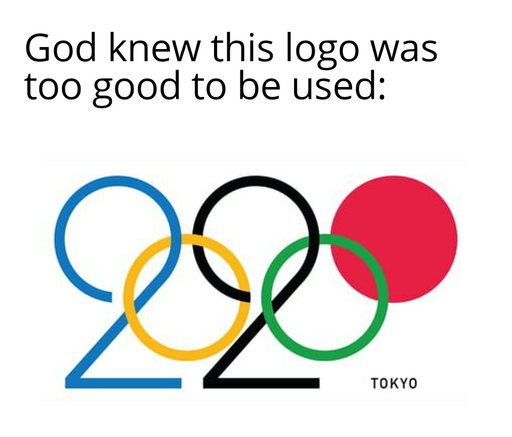
Here's a detailed description of the image: **Overall:** The image features the rejected logo for the 2020 Tokyo Olympics. It's presented in a clean, white space. **Logo Design:** * **Olympic Rings:** The logo incorporates the classic five Olympic rings. The rings are colored in blue, yellow, black, green, and red. * **Shape Integration:** The rings are cleverly integrated with a stylized shape that can be interpreted as a representation of the earth, as well as the letters "TOKYO". * **Typography:** "TOKYO" is written in a modern sans-serif font beneath the rings. **Text Overlay:** A humorous text overlay reads: "God knew this logo was too good to be used.”
No tags assigned
File Name:
image_110.jpg
ID:
#359